American
Society of
Civil
Engineers
Web & Mobile App
Project
Conference Microsites
Timeline
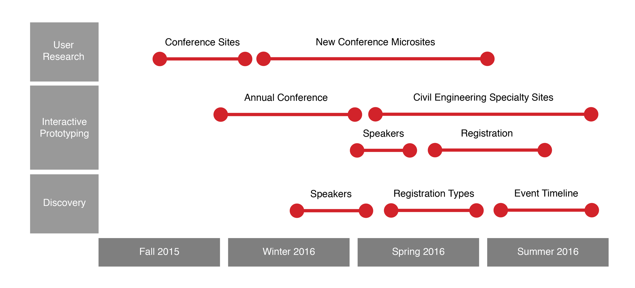
September 2015 - June 2016
The problem
During my time at ASCE, we discovered through interviews that many attendees were using their phones on the floor of the conferences to find speaker info, talk locations, and other event details. However, the site template that we were using was far from mobile friendly, and users were essentially being forced to scroll excessively through the desktop site on their phones.
Background
Conferences were one of the main sources of revenue for ASCE, and one of the main ways that members interacted with the organization. Civil engineers require credits from conferences to maintain their licenses, so the events are an integral part of ongoing professional practice.
The team and my role
I was the only designer on a web team of roughly 10 people, working alongside conference managers, a project manager, and several developers. The web team partnered with the marketing and conference teams, since this project greatly impacted their departments as well. My role was to take input from these different sources to define how content should be structured, then wireframe designs of each page.
Project goals
User Goals
• Use mobile devices to locate conference info like session times, speaker bios, and registration information
Business Goals
• Help conference attendees locate information more easily
• Promote registration and increase conference attendance
Developer Goals:
• Develop a responsive site using Drupal default styles
• Use same basic content structures present on old microsites
Design process
Since I was not an expert in the domain matter of civil engineering conferences, I heavily relied on the discovery phase of the project to learn what was important for each type of attendee. It was also important to determine ASCE’s goals as a company in hosting the conferences–namely, awarding credits to engineers and engaging them through paid membership and event offerings. By learning more about how to prioritize actions and content, I was able to craft low fidelity wireframes. After these were iterated on and approved by users and stakeholders, I applied ASCE styles to fill out the final wireframes.
Existing designs
The old site design was clearly desktop first–pages followed a two column layout that failed to collapse on mobile devices. Consequently, viewing the sites on mobile phones required extensive horizontal and vertical scrolling.
Information was also nested in interior pages. Users had to click through multiple pages to find relevant information, and even then, the interior pages were largely just unformatted blocks of text with subheadings.
Moving forward, then, we sought to:
Display relevant conference information upfront with less clicks
Switch to a one column layout that would be more responsive
Personas
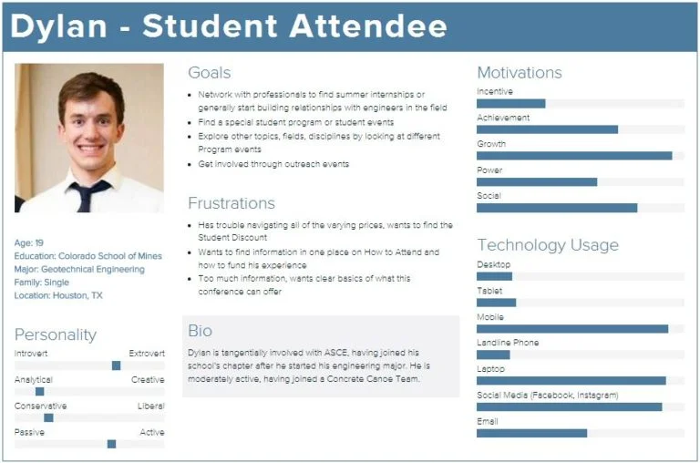
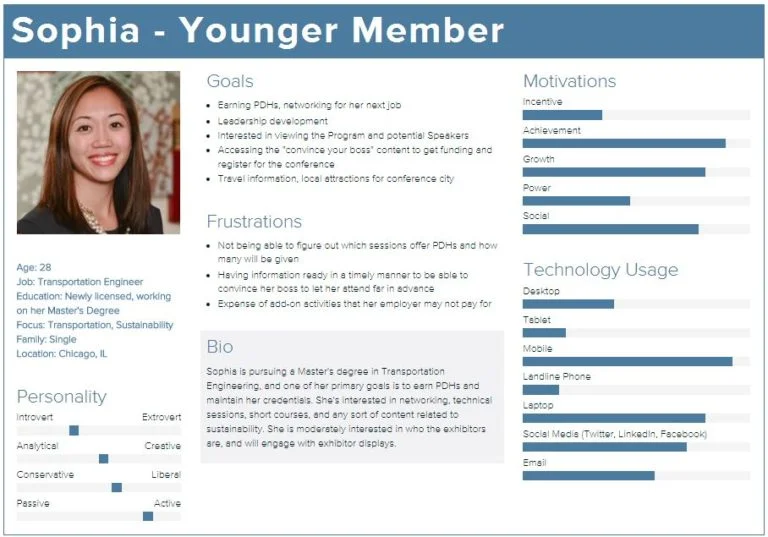
Since many different types of people attend ASCE conferences, and since conferences are catered to niche disciplines, it was important to define a range of potential users. To determine personas, the web team worked with the conference, membership, and marketing departments. Through these discussions, several types of user personas emerged and were mapped with details such as:
Average age, education level, membership type, and stage of civil engineering career
Goals in attending a conference
Frustrations experienced with the current website
Low fidelity mockups
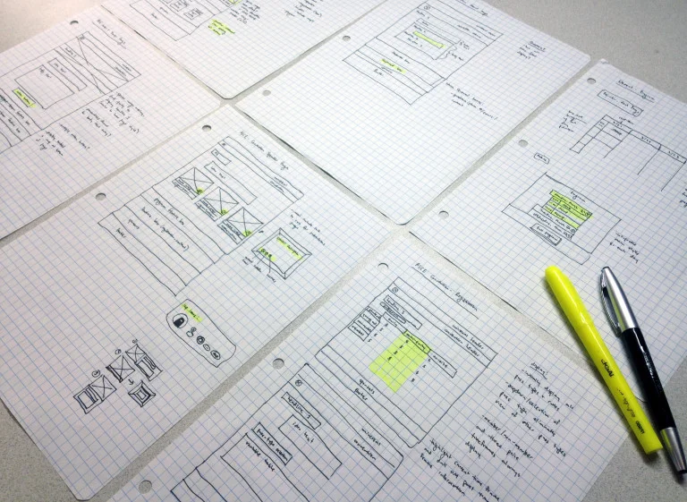
I started the design process by drawing low fidelity mockups with pen and paper. One benefit of this approach was not wasting too much time on any one idea–it’s easier to scrap pen and paper prototype ideas than it is when you’ve invested time actualizing them in a program. I also like to prototype with pen and paper because these wireframes:
Take less time than digital mockups
Are easy to do during meetings to get immediate buy in
Help easily visualize relationships between pages better
After finishing the basic page structures in the mockups, I highlighted interactive features and noted how I thought they should behave under different conditions–hover, click, first visit vs. return visit, etc.
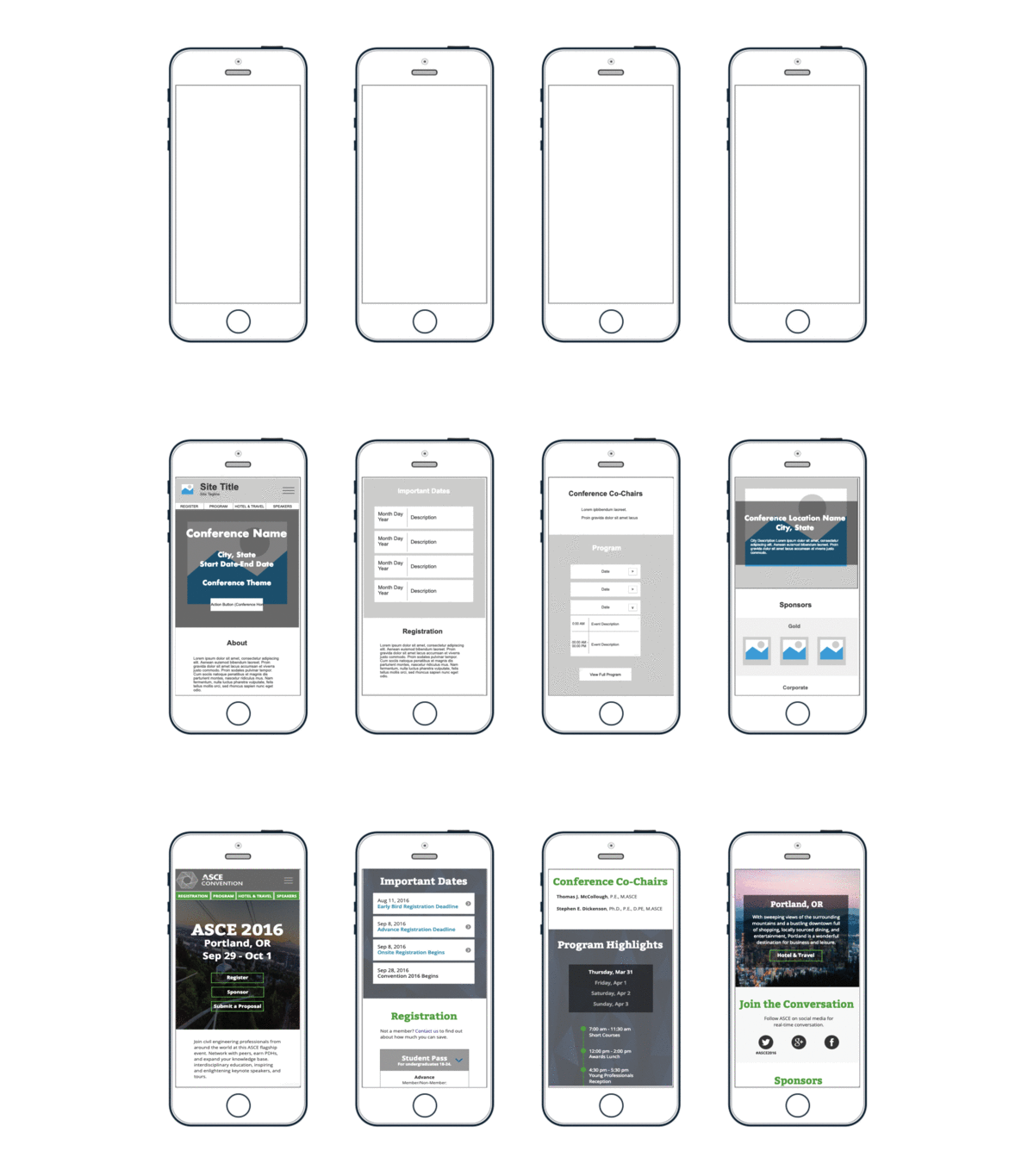
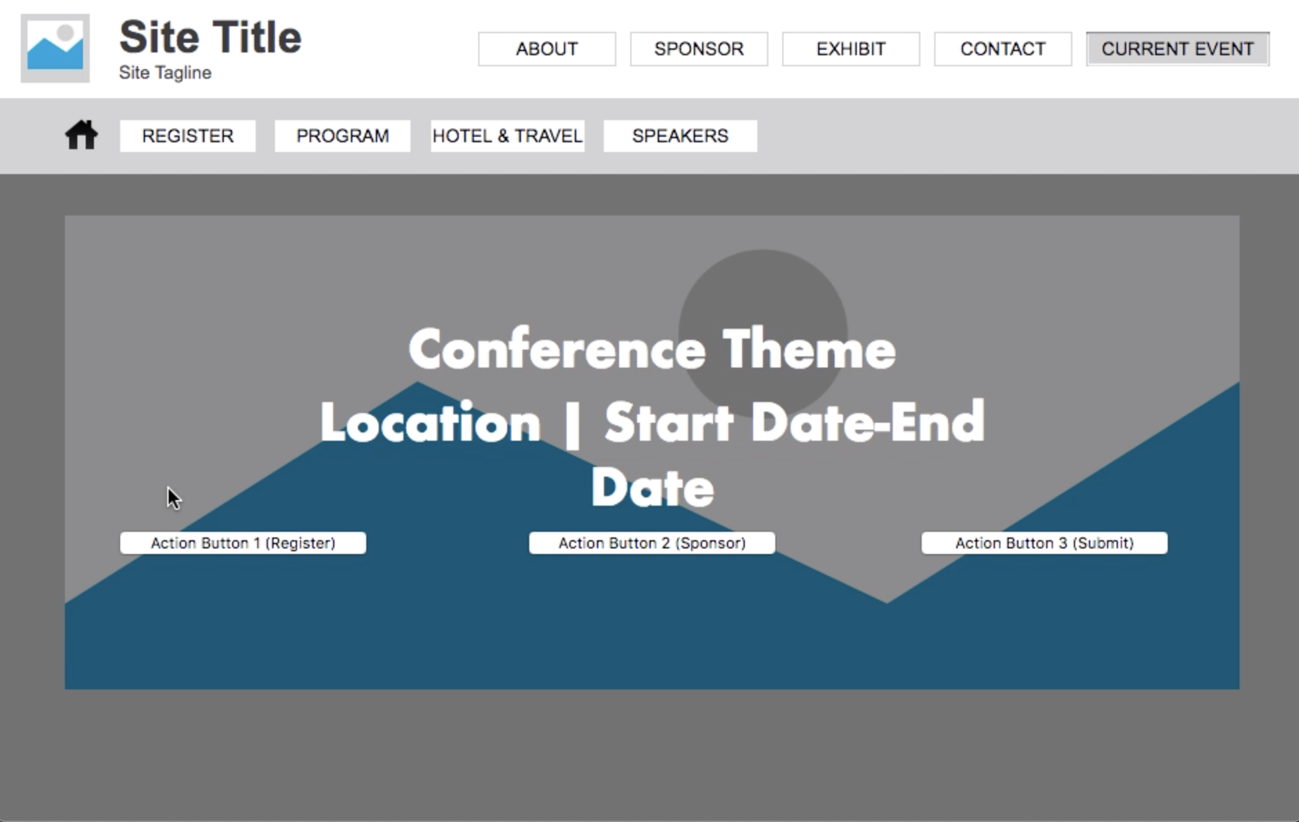
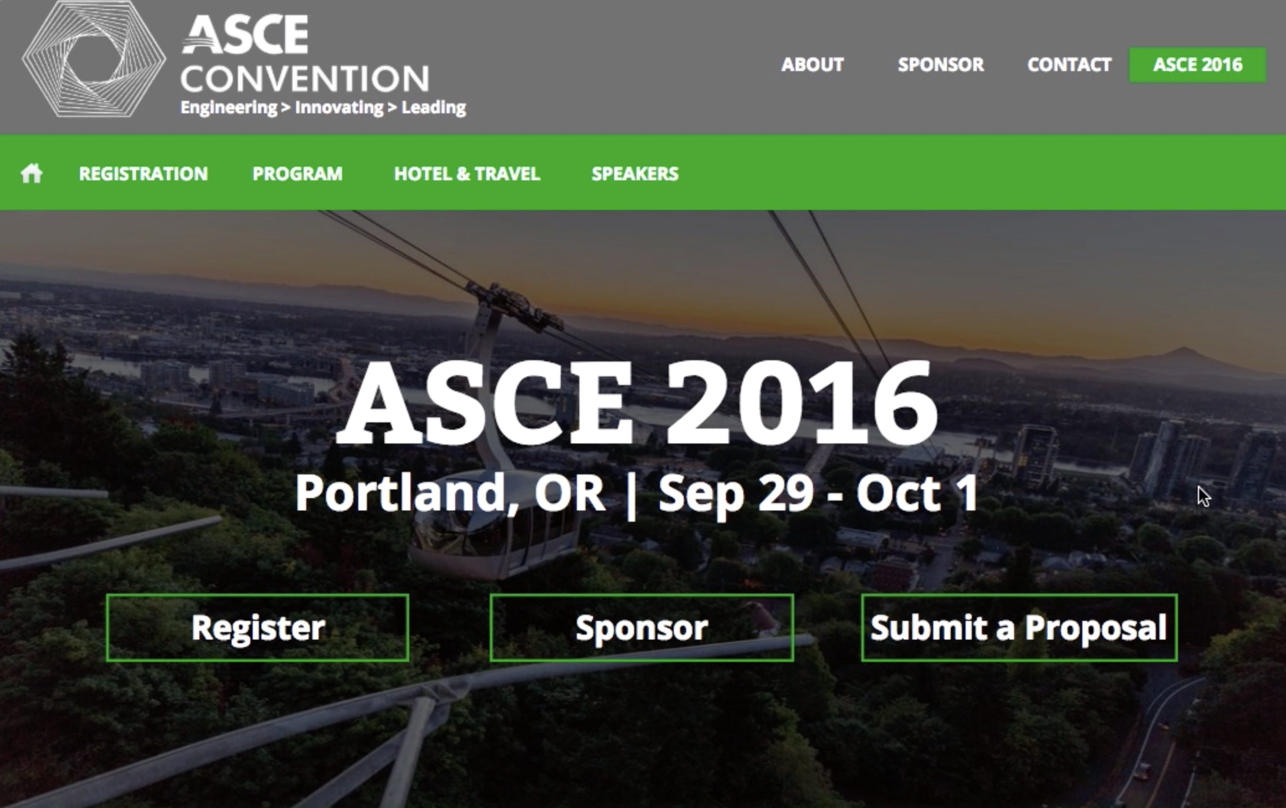
I used Axure to create low fidelity mockups of each conference page. One idea that emerged from user interviews was a home page that included relevant information for registration, speakers, events, and conference location. This would eliminate the need to visit interior pages, resulting in less overall clicks.
After completing the low fidelity interactive prototype, I showcased it to relevant stakeholders for buy in. I made adjustments to certain elements like displays of sponsor logos, then proceeded to high fidelity mockups with greater emphasis on visual design and ASCE brand identity.
High fidelity mockups
After gaining stakeholder approval, I proceeded to iterate on the low fidelity wireframes, using ASCE style guide recommendations to shape the visual design.
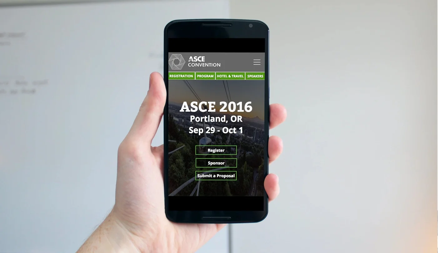
The final product was much more mobile friendly than the old site. We also demoed the site with the conference department, and they were happy that the main page eliminated the need to click through multiple interior pages.
On the Axure site below, the left hand navigation contains links to the mobile mockups as well as the desktop views.
