
Chainlink
Email
Marketing
Web App
Background
In the fall of 2016 I was commissioned to build out an email marketing web application for Chainlink, a small startup in Manhattan. The role involved a mixture of UX and UI—creating new pages that could guide a novice user through email marketing tasks, and mapping content in an intuitive way. Much of the interface work that I did involved dashboards and tables that simplified complex data.
Timeline
September 2017 - March 2018
My Role
When I joined Chainlink there were only three other New York based employees, and a development team in India. I was eager for startup experience to take on multiple roles, and I gained ample experience in all phases of the design cycle. My primary roles as the lead designer were to:
Develop a style guide
Map content and navigation
Work with remote developers to implement designs
Produce high fidelity mockups

Project Goals

User Goals
• Easily send targeted emails to specific customer segments
• Use platform without long onboarding times or extensive marketing knowledge

Business Goals
• Fast development cycle of a minimum viable product (MVP) for basic email marketing tasks
• Incorporate platform elements from similar platforms

Developer Goals
• Low development load by using Bootstrap for basic elements
• Style guide available for quick reference of platform styles and interactivity
Design Process
Since I was working within the budget and parameters of a small sized startup, the design process was iterative but included some low-budget, guerilla practices. Competitive research using software trials helped us ground our work and situate our product against our leading competitors like MailChimp. Our initial pages were user tested in a very informal manner with whoever I could find in the WeWork building we occupied. Once designs were at a place where everyday novice users could figure out actions and content on a page, the designs were critiqued by the startup’s CEOs, and often gained new, innovative features at this stage.
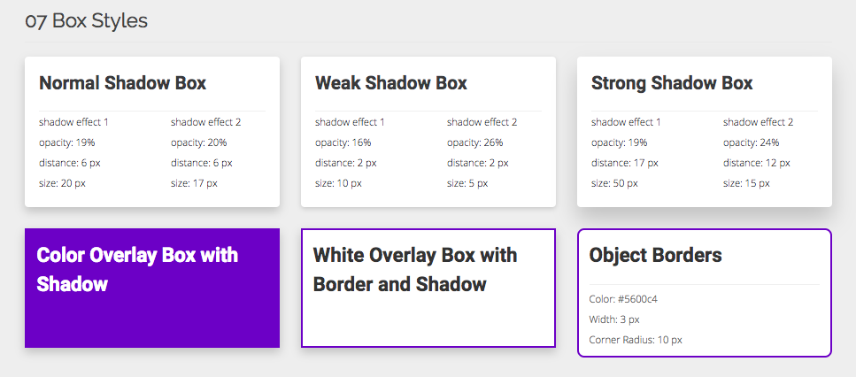
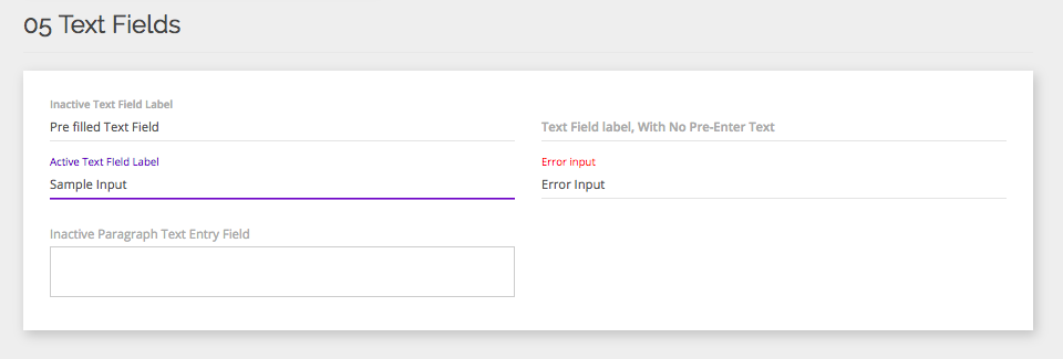
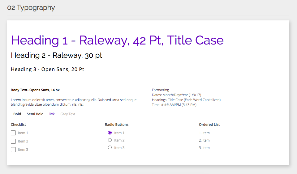
Style Guide
One learning point from my time at Chainlink was that new content development was greatly helped by having a digital style guide. That way, developers could reference existing styles when building any new page elements. We built the style guide in HTML and CSS, including UI specifications for:
Brand identity (colors and typography)
Interactive elements (selection, sliders, overlays)
UI components (buttons, icons, tables)
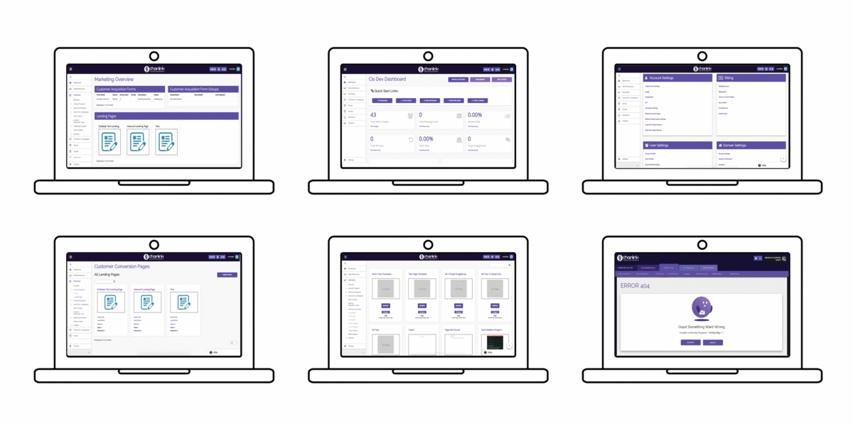
Content Mapping

Content mapping was a collaborative effort with the startups’ CEOs, since each of them had in-depth knowledge of common user tasks and how our platform could innovate to offer new solutions. We also completed ample competitive research on platforms like MailChimp and Hubspot to see how they organized content and prioritized actions.
When organizing content, we kept in mind that the average user had little in-depth knowledge of email marketing tasks. We accommodated this by:
Keeping page and section names simple, avoiding jargon
Organizing content based on task affinity
Incorporating successful features from competitive programs
Working with Developers

One of my biggest learning points was coordinating with offsite developers in India. For many months, I was working remotely from Seattle with the New York based CEOs while I passed designs off to the developers and ensured they got built according to our style guide and specifications. This involved project management on Trello, where I outlined interactions and responsive states.
Lessons that I learned include:
Be as explicit as possible when giving design specifications
Rely on a centralized style guide to guide future designs
Refer back to style guide whenever there are design questions
Communicate early and often about implementation progress
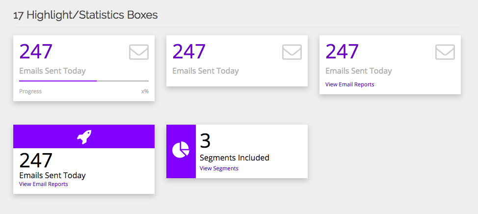
Design Implementation
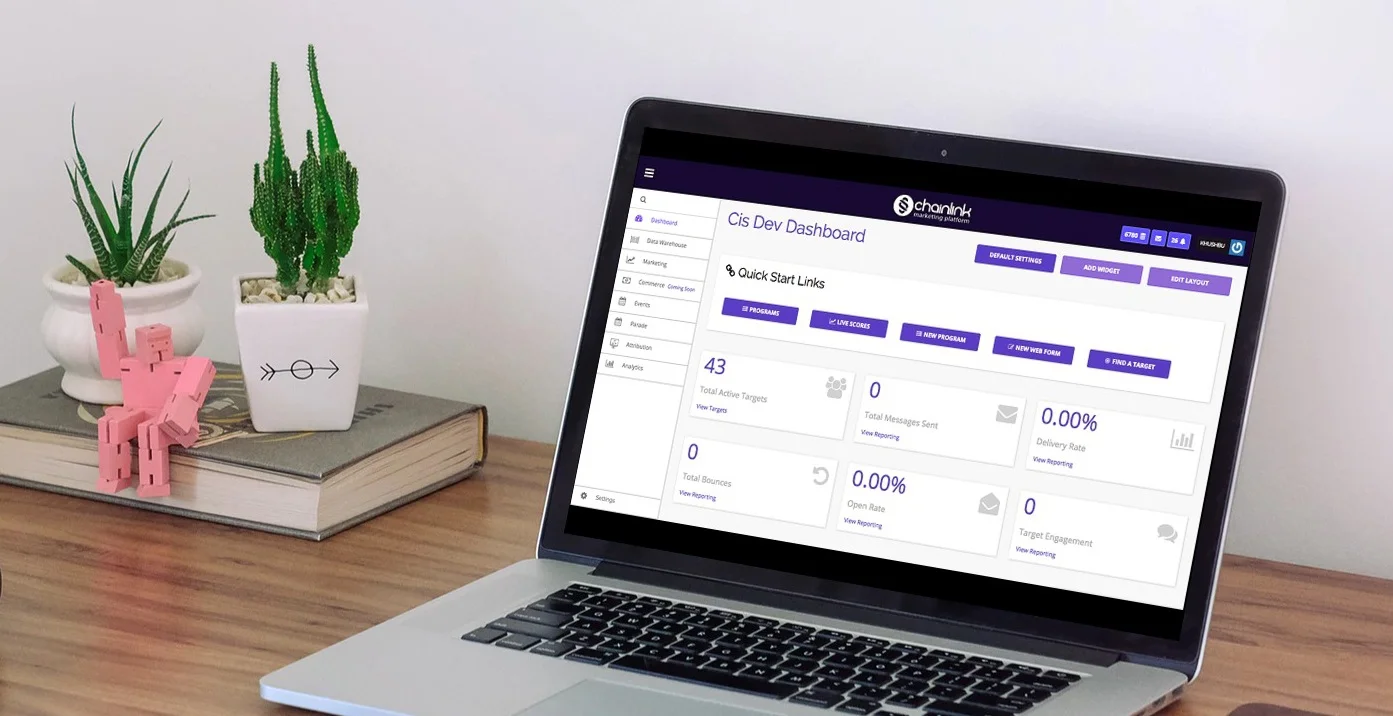
The finished web app was the united product of content mapping work and style guide implementation. Common user tasks, revealed through competitive analysis and interviews, were prioritized on dashboards for each of the main site areas:
Command Center
Data Warehouse
Marketing
Attribution
Performance
Challenges
The biggest challenge that I faced throughout the project was content mapping and organization.

Solution: When mapping the content, we had to take into account the kinds of people who would be using it. While email marketing experts may be the ones purchasing the service for their company, the actual users could be individuals with little expertise in marketing. We had to consider the language used on the app, and tried to make accomplishing marketing tasks as direct as possible, with little resistance for users. We did this by organizing sections and actions based on affinity, prioritizing common tasks on dashboards, and displaying frequently accessed data at the top of relevant pages.