
Washington
State
Art Archive
User Research
Project name
My Public Art Portal
Timeline
January 2018 - March 2018
Background
In the winter of 2018 I was commissioned to help do user research for the My Public Art Portal, a website used by the state of Washington for cataloging public artworks. The site is the only centralized digital archive of Washington State public art–70% of the collection is housed in schools and offices. Started in 1974, it is one of the oldest and largest state art archives with over 4,500 works in its catalogue.
The problem
The UI for searching in the portal was difficult to navigate, and it was hard to tell how the content and navigation were organized. The Washington State Art Commission wanted to determine:
What tasks users wanted to accomplish on the portal
How their site could better facilitate these tasks
The team and my role
I worked alongside several graduate students at the University of Washington. We all took on user researcher roles–specifically, my role was to craft user testing tasks and search scenarios that we could assign to participants.
Project goals

User Goals
• Find specific artworks using the search features of the portal
• View details of artworks
• Discover new artworks

Business Goals
• Boost site traffic with a more intuitive interface and search
• Determine common use cases for portal
• Enable exploration and discovery of new or featured works

Developer Goals
• Work through Axiell, a platform for art archive sites, to improve functionality
• Minimal custom coding–ideally just reorganization of existing content
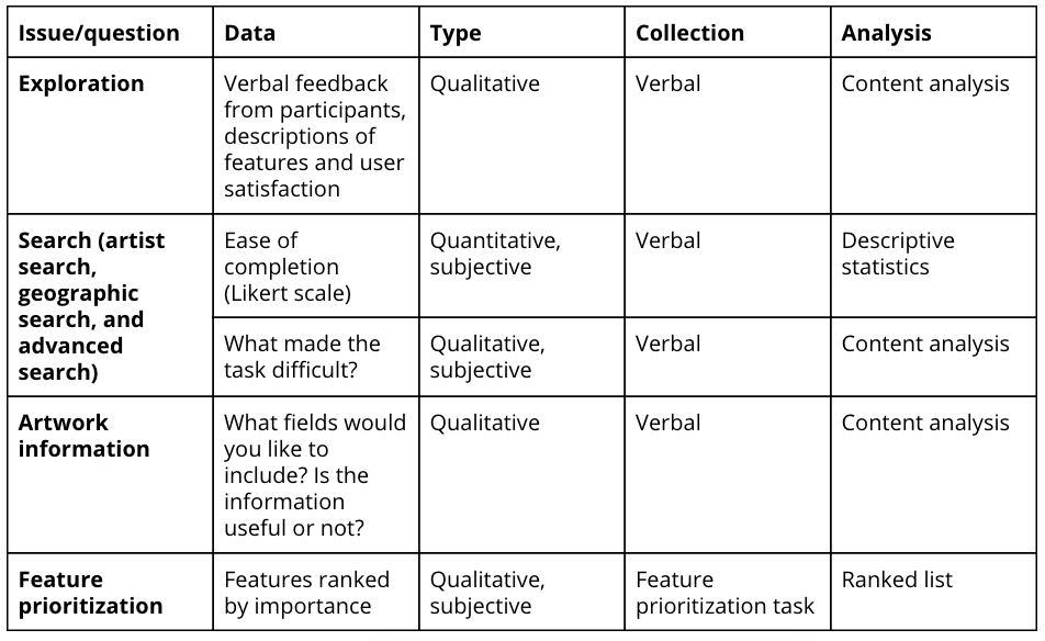
Research objectives
● General impression
What are users’ general impressions of the My Public Art Portal?
● Search tasks
Can a user successfully use the available search tools to find artwork?
● Artwork information
Are participants satisfied with the information presented when viewing an artwork?
● Important features
Which features are most important to the users?
Methodology
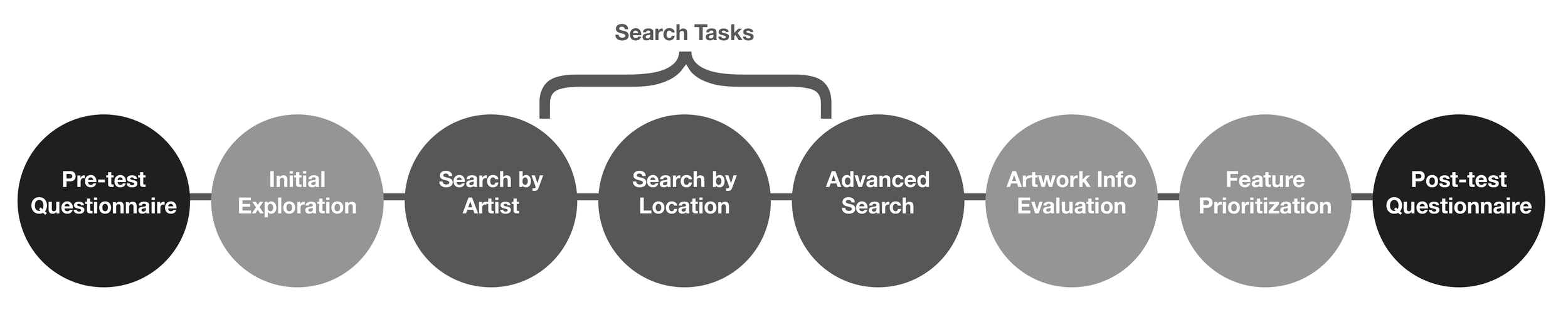
Pre-test questionnaire
We gave an initial pre-test questionnaire to the participants to understand their relationship with art in general, including any work or study experience with art, as well as to see if they knew of or had previously used the My Public Art Portal.
Initial exploration
The first task was an initial exploration where participants were given latitude to explore the portal at their own discretion. Participants were given 5 minutes to explore the My Public Art Portal and describe their impressions.
Search-based tasks
The next three tasks focused specifically on the search functionality and how participants used different features to complete specific searches. Qualitative data was gathered throughout the tasks through think aloud protocol. Participants were asked to indicate when they were confident they had completed the task, and to assess the difficulty of the search using a 5-point Likert measure, where 1 indicated “very easy” and 5 indicated “very difficult.”
Search by artist
Participants were asked to find the artwork “Coyote” by Rick Bartow.
Search by geography
Participants were asked to find an artwork located in King County.
Advanced search
Participants were asked to find all photographs displayed in public schools that were direct acquisitions by the Washington State Art Collective.
Artwork information
The fifth task required participants to give their feedback on the information presented on an individual artwork page. Participants were asked to highlight information that was especially useful, or any information that they perceived as unnecessary on the page.
Feature prioritization
The final task involved the participants using index cards to rank the primary features of the portal according to perceived importance. After completing the task, participants were asked to explain their reasoning for prioritizing their top few features. Participants were also asked to explain any major rules or grouping trends they utilized during the ranking process.
Post-test questionnaire
After all tasks were completed, we asked participants follow-up questions to summarize their experience with the portal. Specifically, we asked if there were any features that should be added or changed within the portal, and if there were any other pain points unaddressed by the study that the participant wanted to bring to our attention.
Key findings
“[The] search bar should be on the main page, and not under advanced search”
Search
● 7 out of 7 participants feel there should be a more prominent search bar.
● 3 out of 7 participants mentioned that having too many parameters within the search feature is confusing.

Navigation
● 4 out of 7 participants thought the side navigation menu was unintuitive.
● 1 out of 7 participants specifically pointed out that pervasive menu content was especially confusing.

Artworks
● 6 out of 7 participants felt that the layout of the artwork page could be improved.
● 4 out of 7 participants wanted more and/or higher resolution images, with zoom capabilities.
● 3 out of7 participants wanted better use of whitespace.

Language
● 4 out of 7 participants expressed confusion about the language used on the portal.
Recommendations


Search functionality
In addition to search fixes that the client mentioned during our initial meeting–using information from the artist biography and artwork descriptions sections in search, enabling partial searches–the Washington State Arts Commission should aim to unify all search functionality into one cohesive tool. Browse by artist and search by geography could be options as part of a quick search, for example, with the option to complete a more advanced search.
Side navigation
We recommend alterations to the side navigation menu to make it more intuitive and engaging. The links in the side navigation menu could be better grouped thematically (e.g., “Browse by...” and “Advanced Search”). In addition, the pervasive links menu was confusing to many participants, as they expected a menu on the right to match the content on the current page.
Artwork information
For artwork information, we would recommend increasing the font size of the information displayed. Two of the participants also mentioned that they would like to see the artwork information displayed alongside the images and not below them. We think this is a possible option to explore as it would allow users to view the artwork information while concurrently viewing images of the artwork.
Language
We recommend doing walkthrough of the site and flagging any language that could potentially be confusing, taking into account the specific examples we found in our study including: differentiating between “Recent Acquisitions” and “Recent Additions to the Portal,” as well as renaming certain fields in advanced search feature such as “Site,” “Site Type,” and “Category.” It may be beneficial to elicit the input of a practicing artist or art educator to ensure the terminology used is consistent with the current lexicon used in the art world.