
Premera
Blue
Cross
Internal Software
Project Name
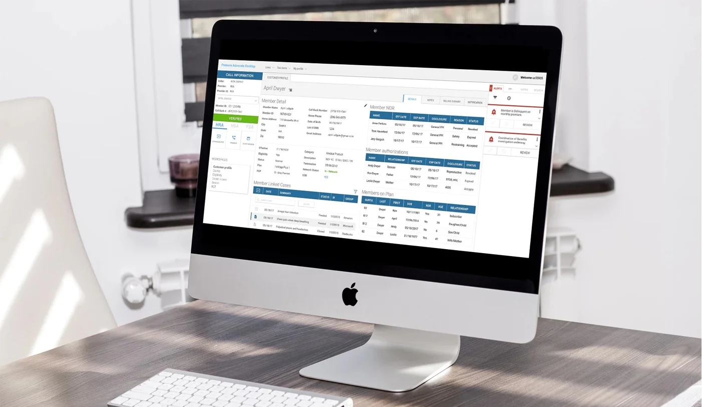
Advocate Desktop
Timeline
June 2018 - December 2018
The Team and My Role
I partnered with another UX designer on an Agile team with developers, project managers, and business consultants. Our team was part of a larger B2B design team that we worked with during design critiques.
Background
Customer service representatives (CSRs) at Premera had been using an outdated interface called Facets for years to answer customer phone calls about health insurance benefits, eligibility, claims, etc. CSRs require 12 weeks of training to be able to answer even basic calls from medical providers, and the Facets application that they used was far from intuitive. The goal of Advocate Desktop was to build a new program in Microsoft Dynamics that would result in:
Less average times for calls
A shorter training period for CSRs (from 12 weeks to 8 weeks)
A more intuitive application for answering customer inquiries

Design Process

This role was my first opportunity working on an Agile team. During each 2 week sprint, the designers were assigned one or two features to research, design, test, and iterate on before passing off a prototype of our solution to the development team. Often, I coordinated with the senior designer to produce two designs that could be tested against each other to see which design direction to pursue. Once we had a design that CSRs liked, we worked with developers to incorporate more styles native to Microsoft Dynamics.
Project Goals

User (CSR) Goals
• Easily find and communicate health insurance details to customers
• Spend less time completing customer service tasks

Business Goals
• Reduce average call times
• Reduce the training period for CSRs from 12 weeks to 8 weeks
• Increase customer satisfaction

Developer Goals
• Low code/no code page designs using Microsoft Dynamics
• Supply accurate data in program necessary for CSR tasks
Information Architecture
Throughout the design lifecycle, we periodically circled back to information architecture diagrams of both Facets and Advocate Desktop. These helped us visualize the screens that CSRs would need to access to accomplish tasks associated with features, and helped us understand where and how we were making improvements over the old interface.
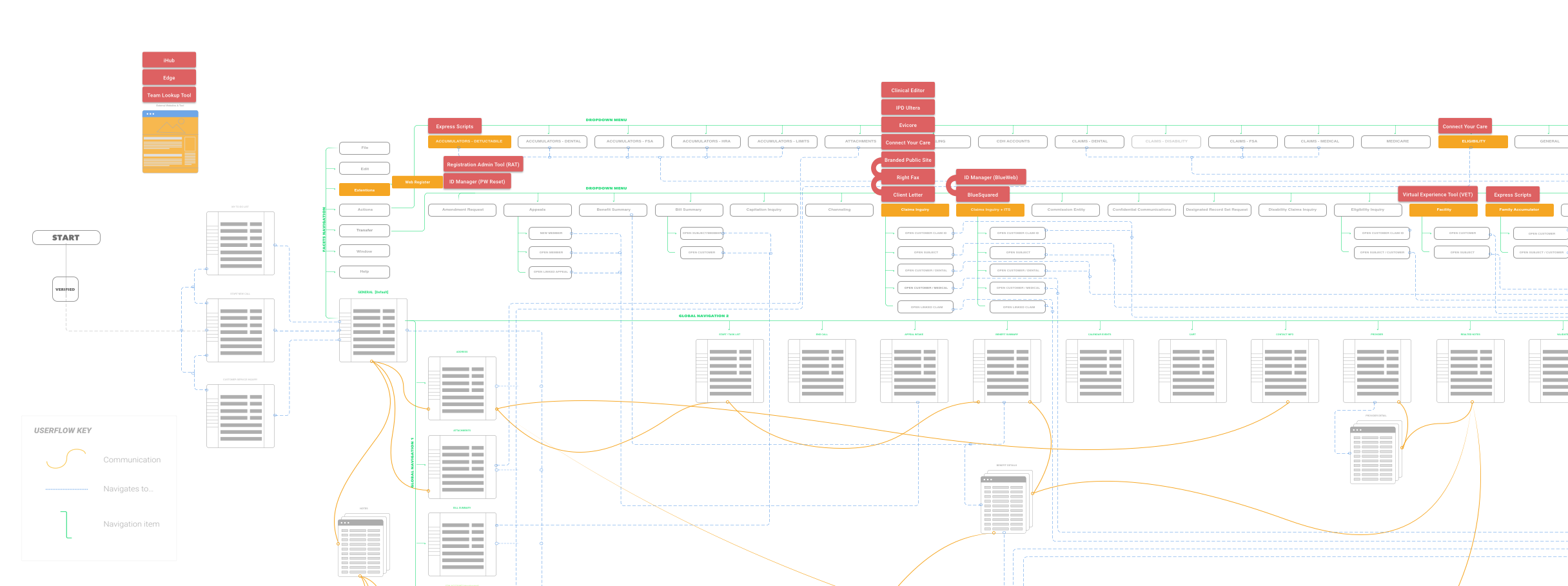
One of my main focuses during the information architecture phase was to visualize exits points from the Facets application. One goal of Advocate Desktop was to integrate as many features as possible from other programs into one, eliminating the need to have multiple screens and tabs open when accomplishing tasks. Charting exit points was useful for understanding which external applications to integrate, and which pages to include functionality on.
User Testing
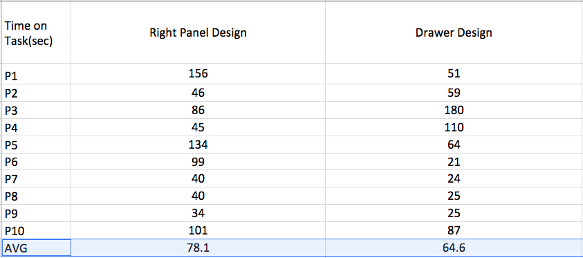
We conducted user testing remotely by sending CSRs our InVision prototype and using Skype screen share to time, observe, and interview CSRs about their experience accomplishing sample tasks. We looked at things like:
Time on task
Ease of task completion (Likert scale)
Qualitative assessment of design
Where did they expect features to be located?
What are related tasks they’d have to accomplish after the one assigned?
With time on task, we were really looking for an improvement over the amount of time it took them to complete the task in Facets. Qualitative assessments were split into positive and negative comments for each design, then summarized in simple, actionable ways, such as:
"3 out of 8 users tested found that inclusion of the icons useful for distinguishing the type of primary care provider."
"6 out of 10 users tested commented that the profile page felt too busy, and recommended less content on this page."
Keystrokes
One of the most immediate ways to CSRs time on simple tasks would be to encode hotkeys into the Advocate Desktop program. To help determine appropriate keystrokes to associate with tasks, I completed an inventory of:
Keystrokes in Facets
Keystrokes in Microsoft Dynamics
Keystrokes in Windows (general)
Recommendations for keystrokes for Advocate Desktop based on these
I then outlined any potential areas where these keystrokes would conflict, for example if a command in Facets overlapped with an existing Windows keystroke. My goal was to retain as many of the Facets keystrokes as possible, since CSRs already memorized and relied on these.
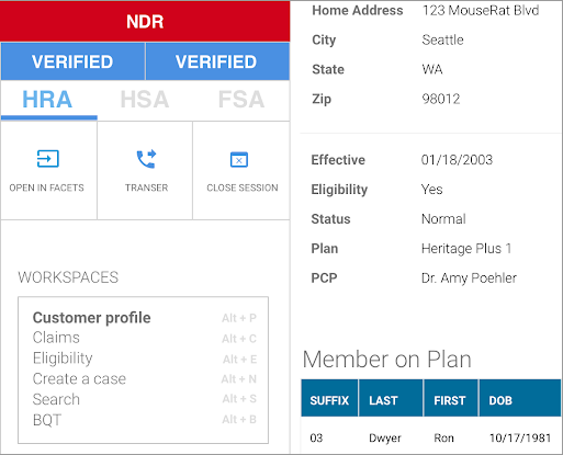
One challenge was figuring out how to help CSRs learn new keystrokes. Shadow text pictured to the left in the Workplaces navigation was one way that we proposed to scaffold learning new behaviors.
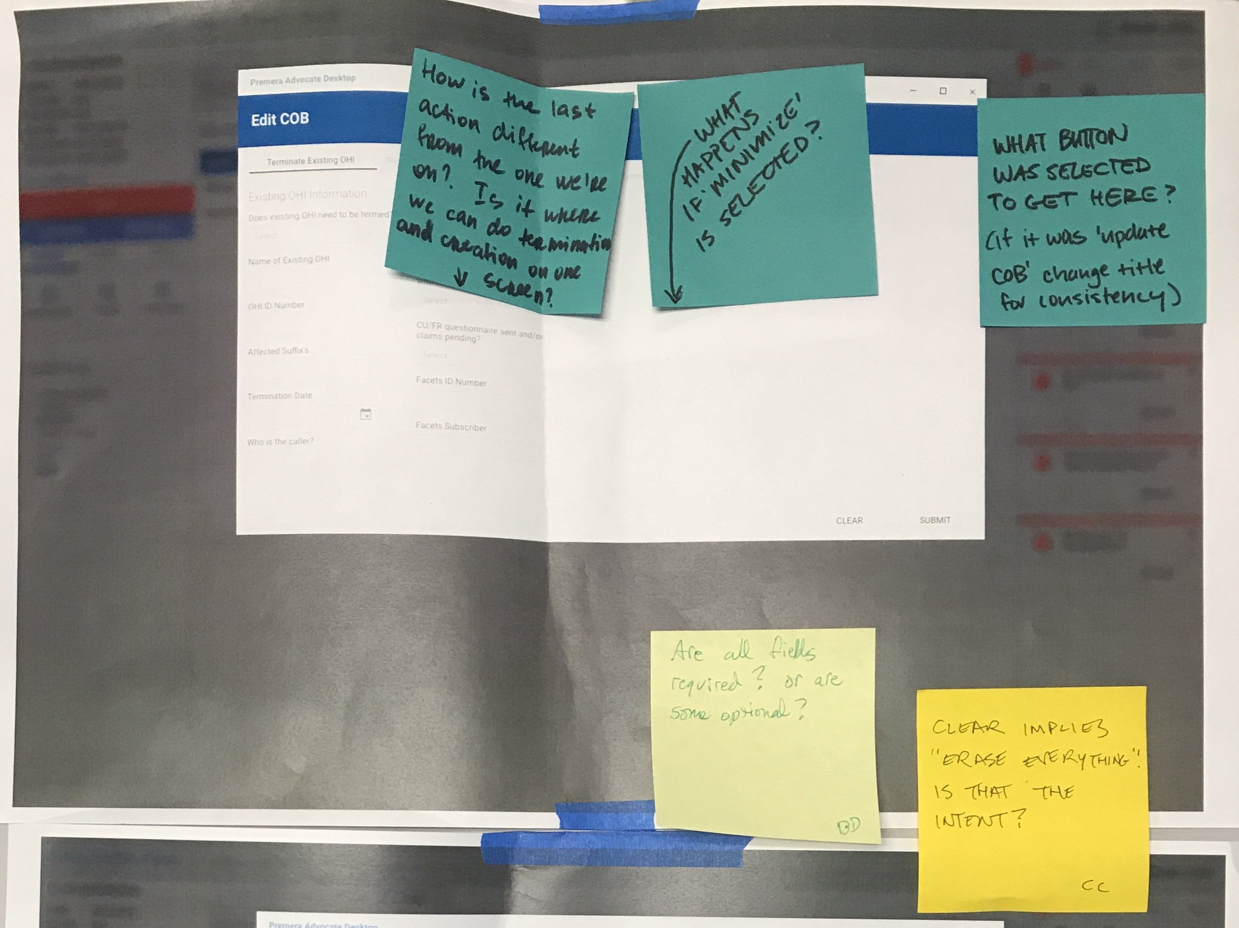
Design Example: Alerts
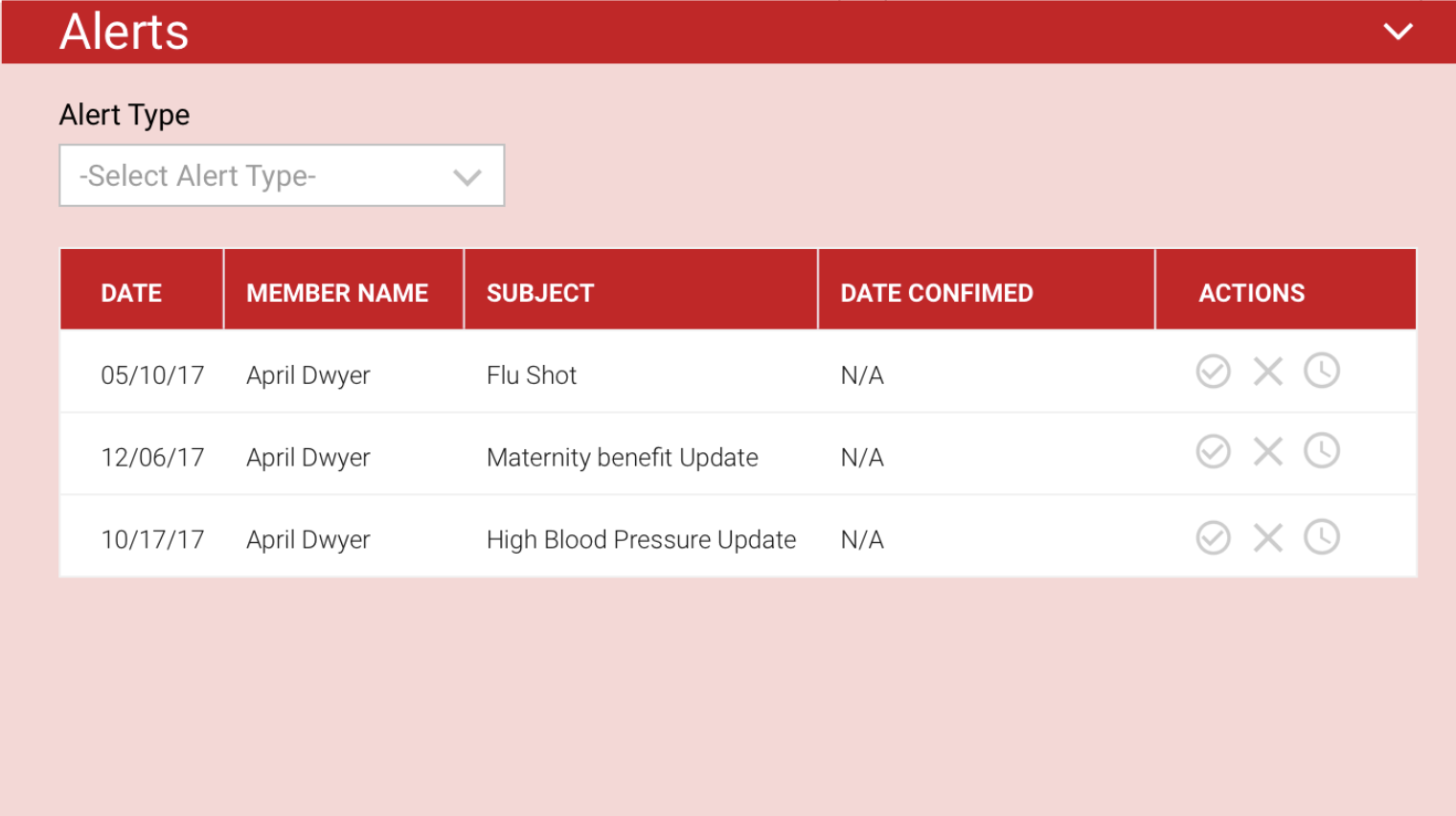
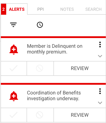
One of the most difficult design challenges that I worked on during my time at Premera was displaying alerts. Alerts were used to indicate to a CSR when there was something that had to be addressed during a call–like a claim under investigation or an out-of-date address for their account. We struggled with where to include these alerts, since it was a business requirement that they be accessible from any page of the platform. We came up with several designs to test against each other for efficiency and ease:
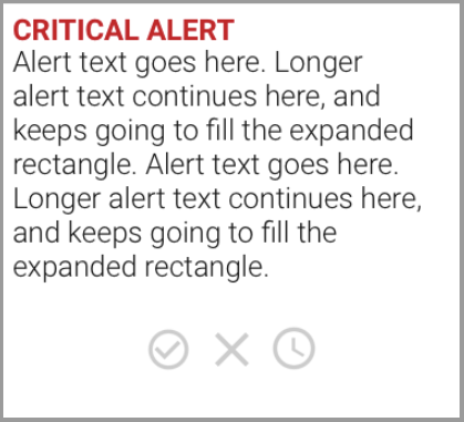
Drawer Design
This iteration placed alerts in a drawer on the bottom right corner of the page. CSRs could mark alerts as approved (completed), declined, or delay them to display later.
Top Level Boxes
We also tried a design where alerts were displayed in boxes in a row along the top of the page. These boxes contained the same approve/deny/delay functionality.
Sidebar
Alerts were included in a tab on the right side of the page.
Top Level Dropdown
Alerts were housed in a dropdown activated by clicking on a bell icon. This design was inspired by alerts UI on well-known platforms like Facebook and Youtube.
Challenges
Improvement vs. recreation
One of the biggest challenges was ensuring that we were not simply recreating Facets. This was addressed through use of information architecture diagrams to ensure that we were making useful navigational connections for CSRs not present in Facets, as well as quantitative measurements of designs like less clicks and less time spent on task. More than anything, this was accomplished by listening to CSRs describe deficits of Facets, and including features that CSRs indicating would be useful to make their jobs easier. In this way, it was useful to straddle the line of researcher and designer, since we could use first hand accounts when crafting new flows.
Determining pain points
Another challenge that I encountered during user research was that, in many cases, CSRs had adapted their behaviors to Facets so well that they couldn't describe sources of frustration. One goal of interviews and observations, then, was to pinpoint these idiosyncratic behaviors, since users did them subconsciously. Often times these automatic behaviors were ones that revealed huge faults in the application, like the need to click on one item before being able to open up the one they really wanted. This taught me that you can't always just ask someone what's wrong with a process or interface–you have to dig deeper and uncover areas for improvement.
